DESIGN
sprintworks Brand Identity #2- The Logo

Sahana Samanta
Design Manager
16 April 2026
A logo is often the most immediate symbol of a brand’s identity. At first glance, it can feel deceptively simple. Think of Nike’s swoosh or Apple’s apple. But arriving at that simplicity takes time, intention, and a lot of questioning.
For Sprintworks, the challenge began with the name itself.
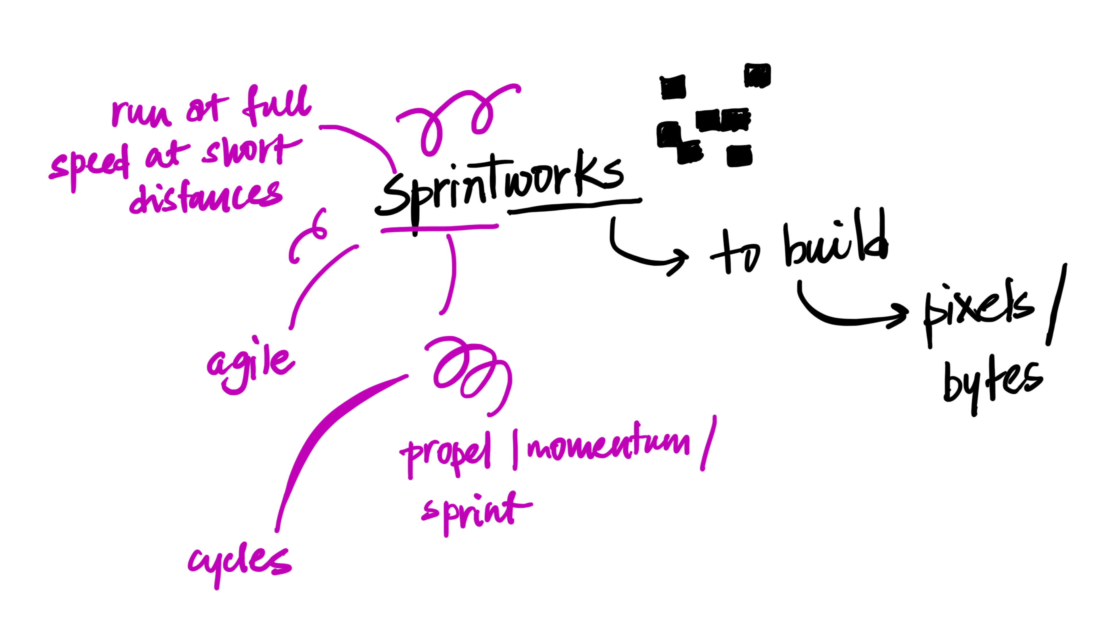
Sprint implies speed, momentum, and to charge forward. Works suggests building, grounding, and making things last. At first, these ideas felt almost contradictory. How do you visually represent both motion and stability in a single mark? That question is where the design process began.
From Concept to Form
Sprintworks’ core strength lies in its sprint-based business model and agility. Speed is not just a feature of how the company works; it is central to its philosophy. So naturally, we started by unpacking what speed looks like visually.
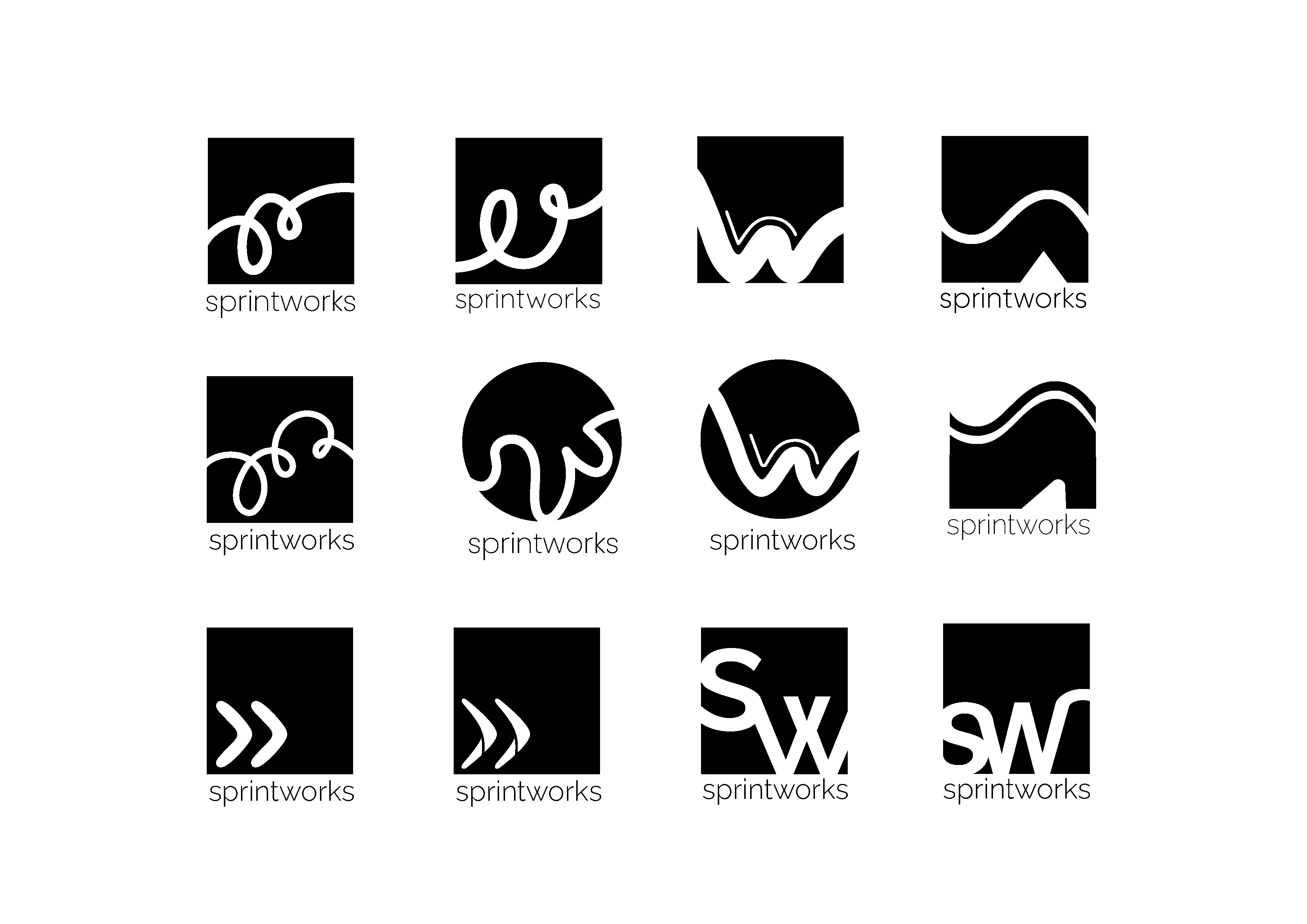
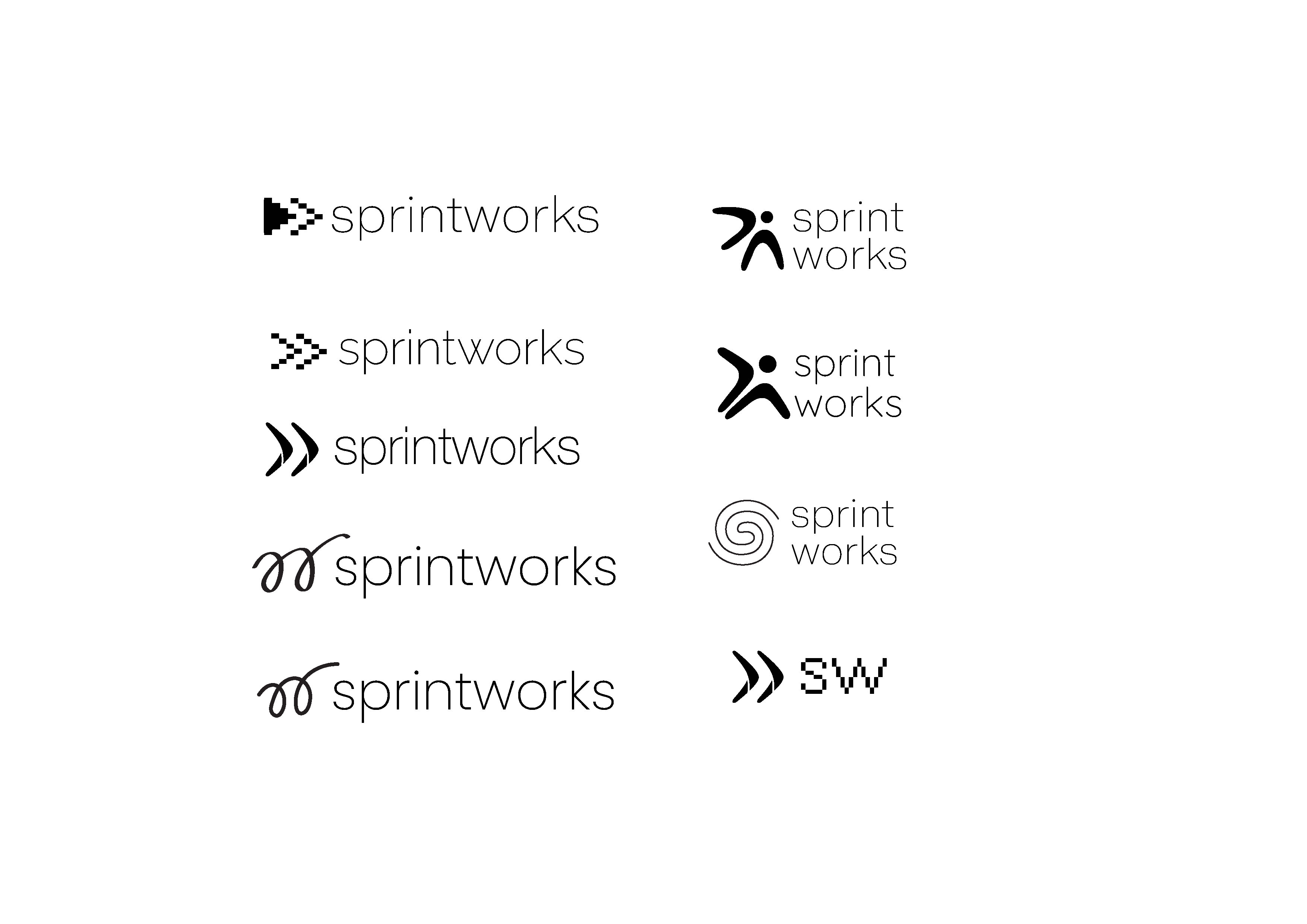
Speed often translates to motion. Motion can be expressed through forms like arrows, curves, or tension-filled shapes. But one form stood out more than the rest: the spring.
A spring represents propulsion. It stores energy, releases momentum, and enables movement with intent. More importantly, it also materialises effort into action. This mirrors exactly what sprintworks helps businesses do, compress ideas, build momentum, and launch forward.
The Wordmark Solution
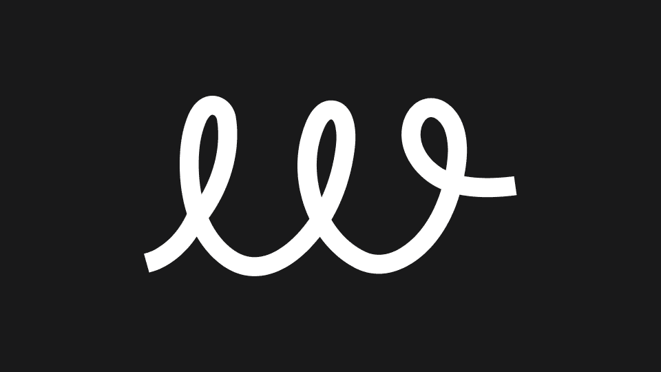
Instead of creating a separate symbol, the idea evolved into embedding meaning directly into the wordmark. The letter “w” in sprintworks became an opportunity.
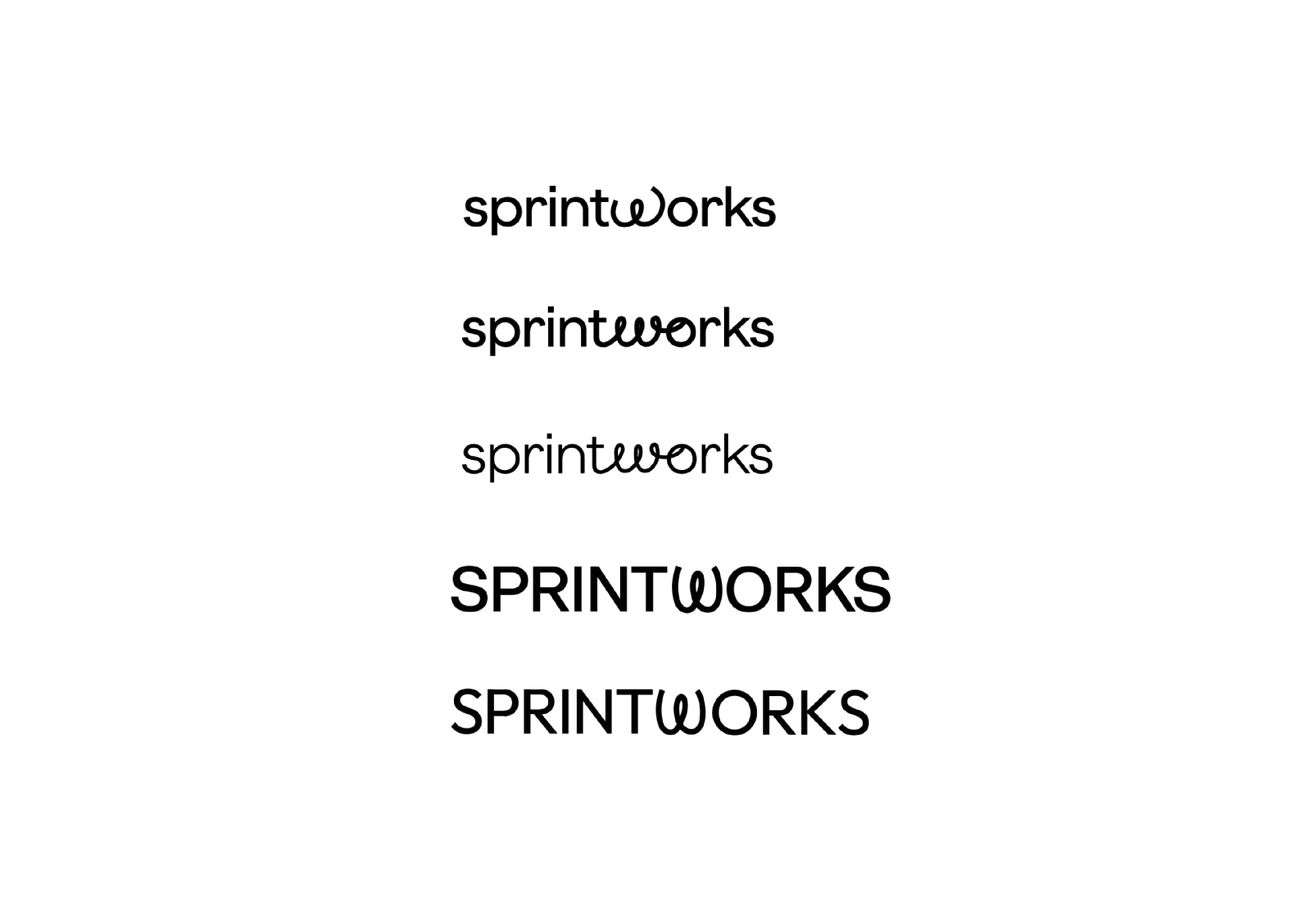
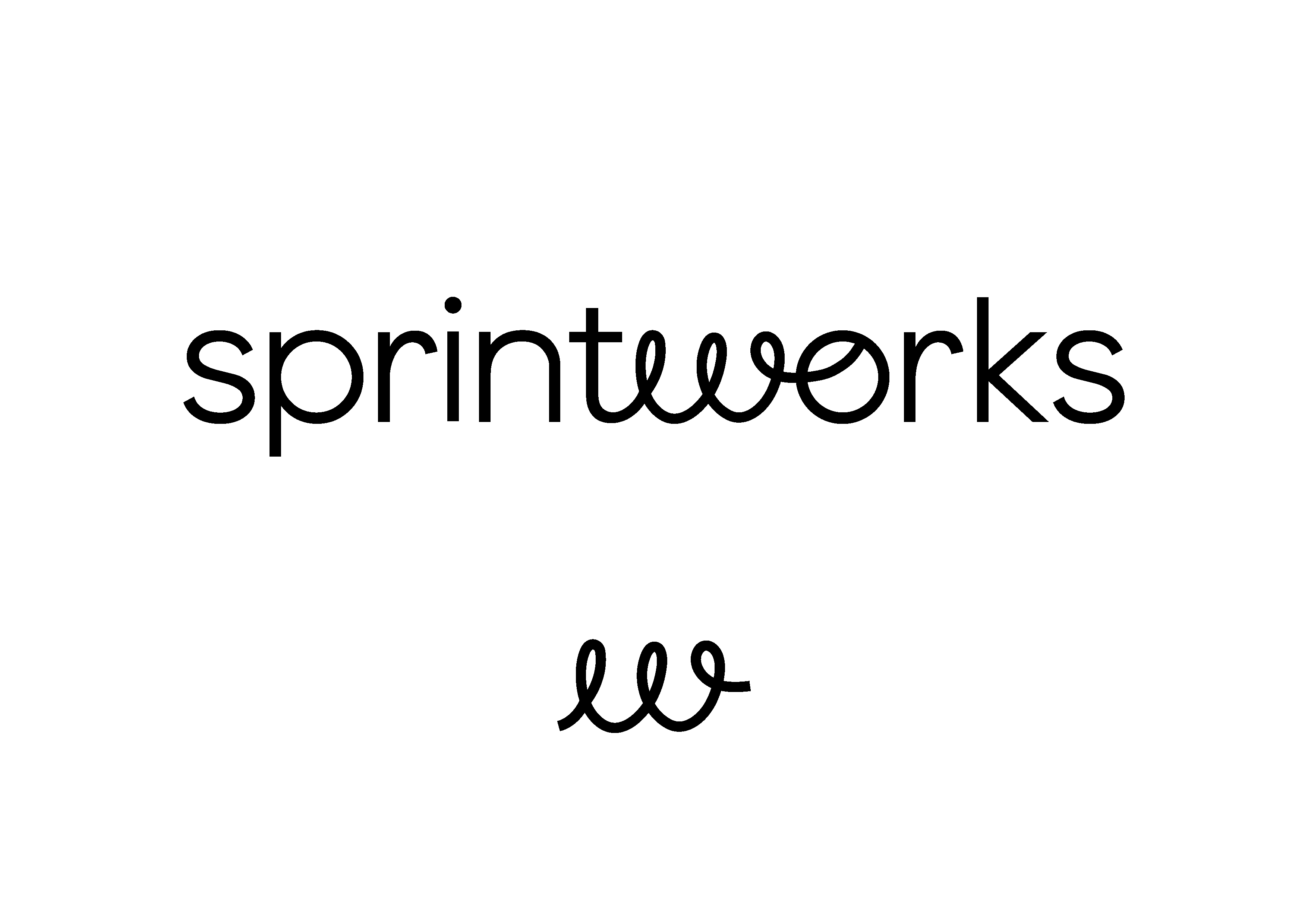
By reimagining the “w” as a spring, we introduced motion into the logo without disrupting readability. The rest of the letters remain clean, stable, and unchanged, grounding the mark and reinforcing the “works” aspect of the brand. The result is a logo that moves without looking unstable, and feels solid without appearing static. Together, the wordmark balances agility and structure, sprint and build.