DESIGN
sprintworks Brand Identity #3- Colour, Typography & Visual Language

Sahana Samanta
Design Manager
16 April 2026
Designing the visual language for sprintworks was about translating an abstract idea of agility and iteration into something instantly recognisable.
Unlike the name or logo, which captures meaning in a single moment, the visual system had to work across everything: interfaces, presentations, documentation, and digital experiences.
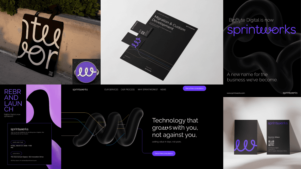
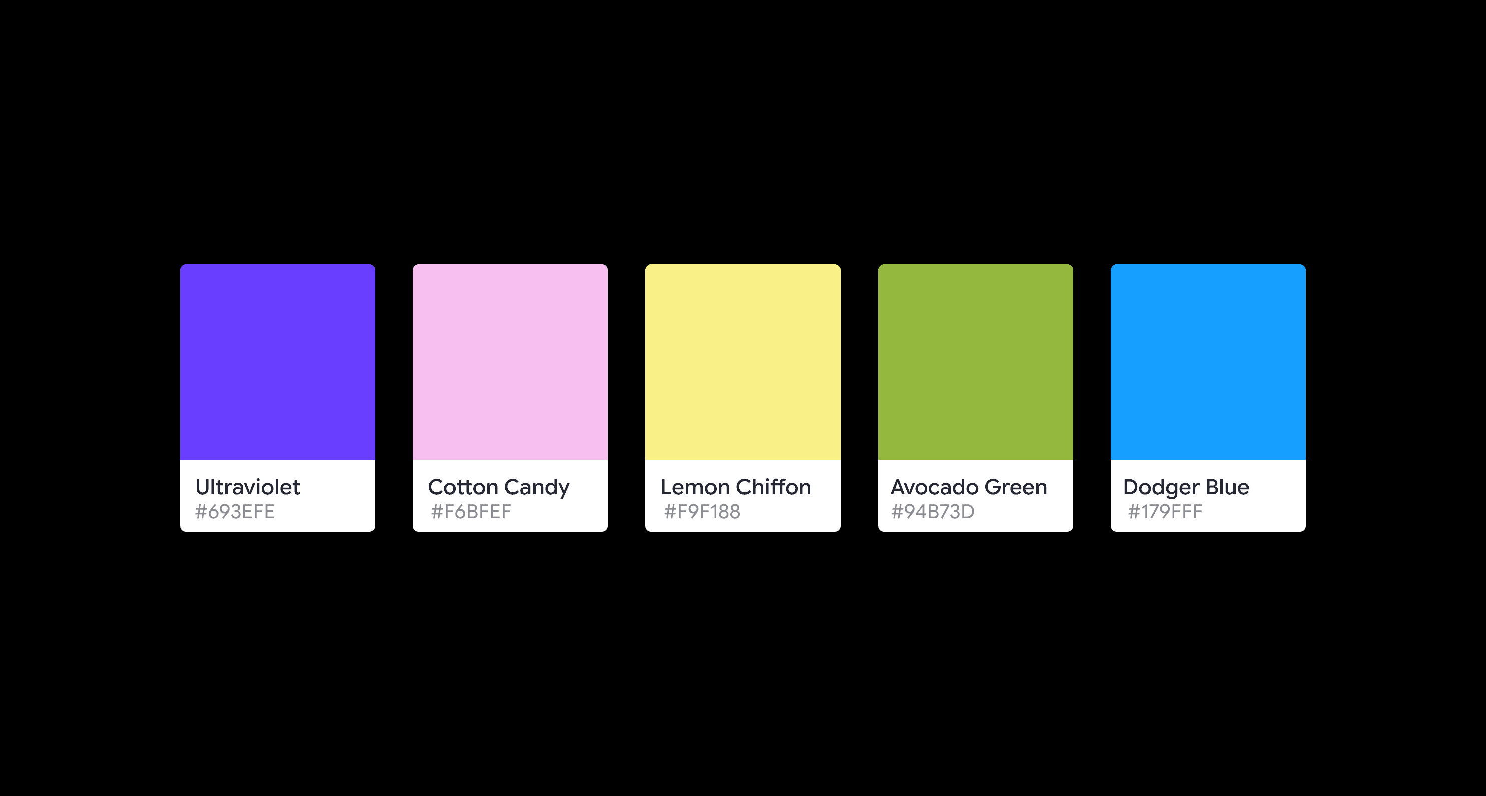
Colour: Energy Meets Precision
The colour palette draws direct inspiration from coding environments, where logic and creativity coexist. This reference grounds sprintworks in its technical foundation while also reflecting the environments many of us are already familiar with.
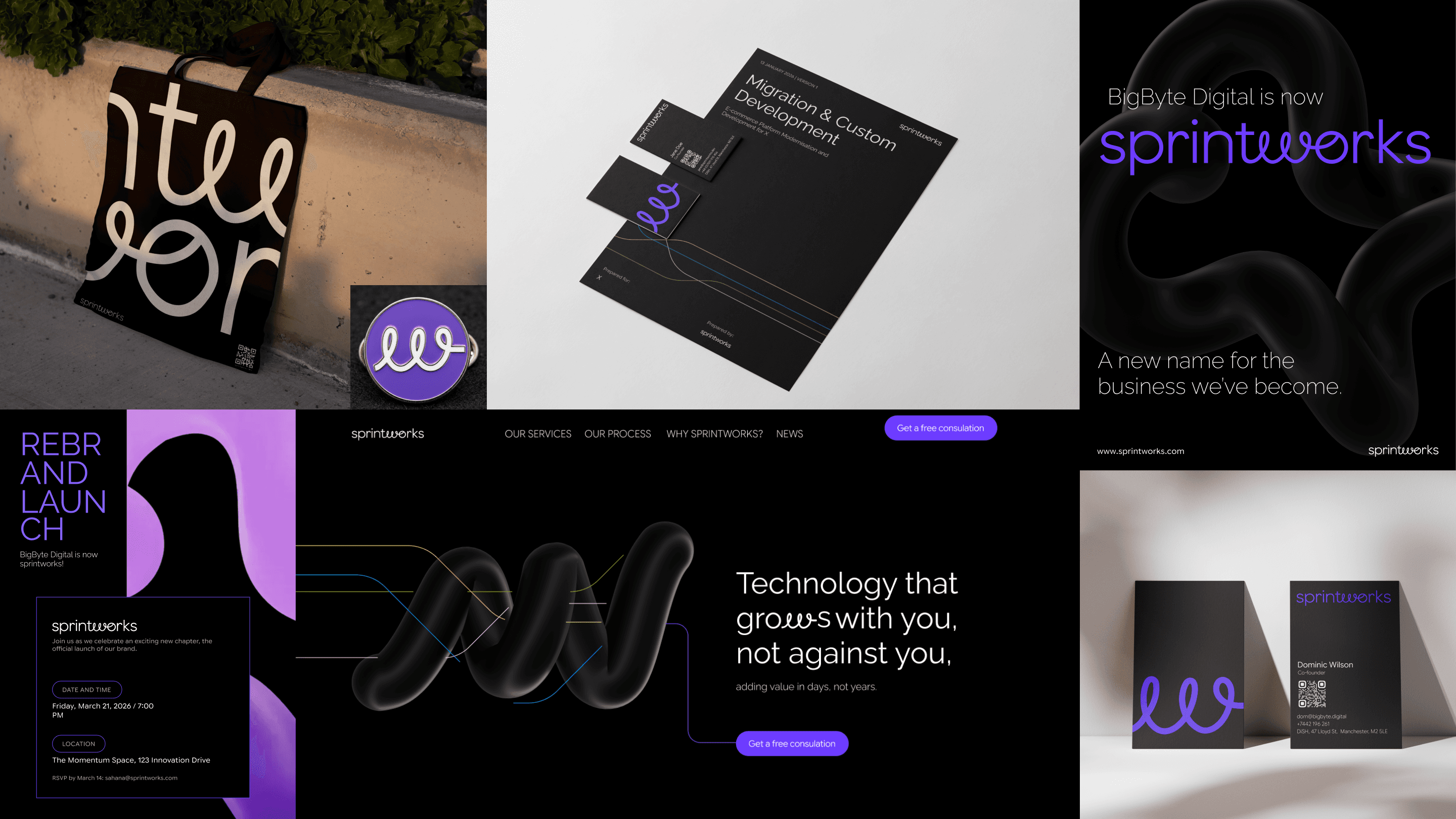
At the centre of the palette is a bright, electric purple.
This is not a passive brand colour. It represents momentum, forward movement, innovation and a sense of charge and intensity.
Purple also sits between blue (logic, trust) and red (energy, action), making it a natural bridge between thinking and doing, which is exactly where sprintworks operates.
To support this, we introduced a dark mode-first approach. The dark interface creates contrast, allowing the purple to glow with clarity and purpose. It also reflects modern digital workflows, where designers and developers often work in high-focus environments.
Complementing this are two supporting systems:
- Neon accents: used to highlight action, interaction, and key moments
- Pastel tones: used to soften the experience, introduce hierarchy, and prevent visual fatigue
This balance ensures the system feels energetic without becoming overwhelming, and expressive without losing control.
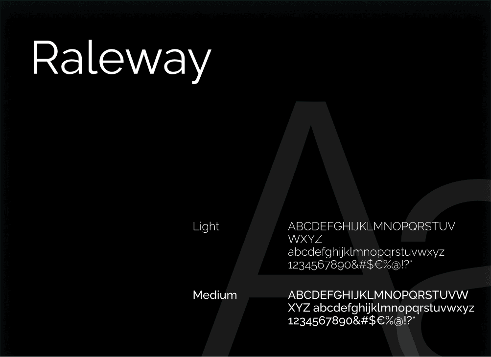
Typography: Structure with Flexibility
Typography plays a critical role in reinforcing both sides of the sprintworks identity, speed and stability.
The primary typeface, Raleway, brings structure and clarity. Its geometric foundation gives it a clean, modern presence, while its slight humanist touches prevent it from feeling too rigid. It works particularly well in headlines and key messaging, where clarity and confidence are essential.
For supporting content, we chose Google Sans Flex. This typeface introduces flexibility, both visually and technically:
- It adapts seamlessly across digital environments
- It supports dynamic systems where hierarchy and responsiveness matter
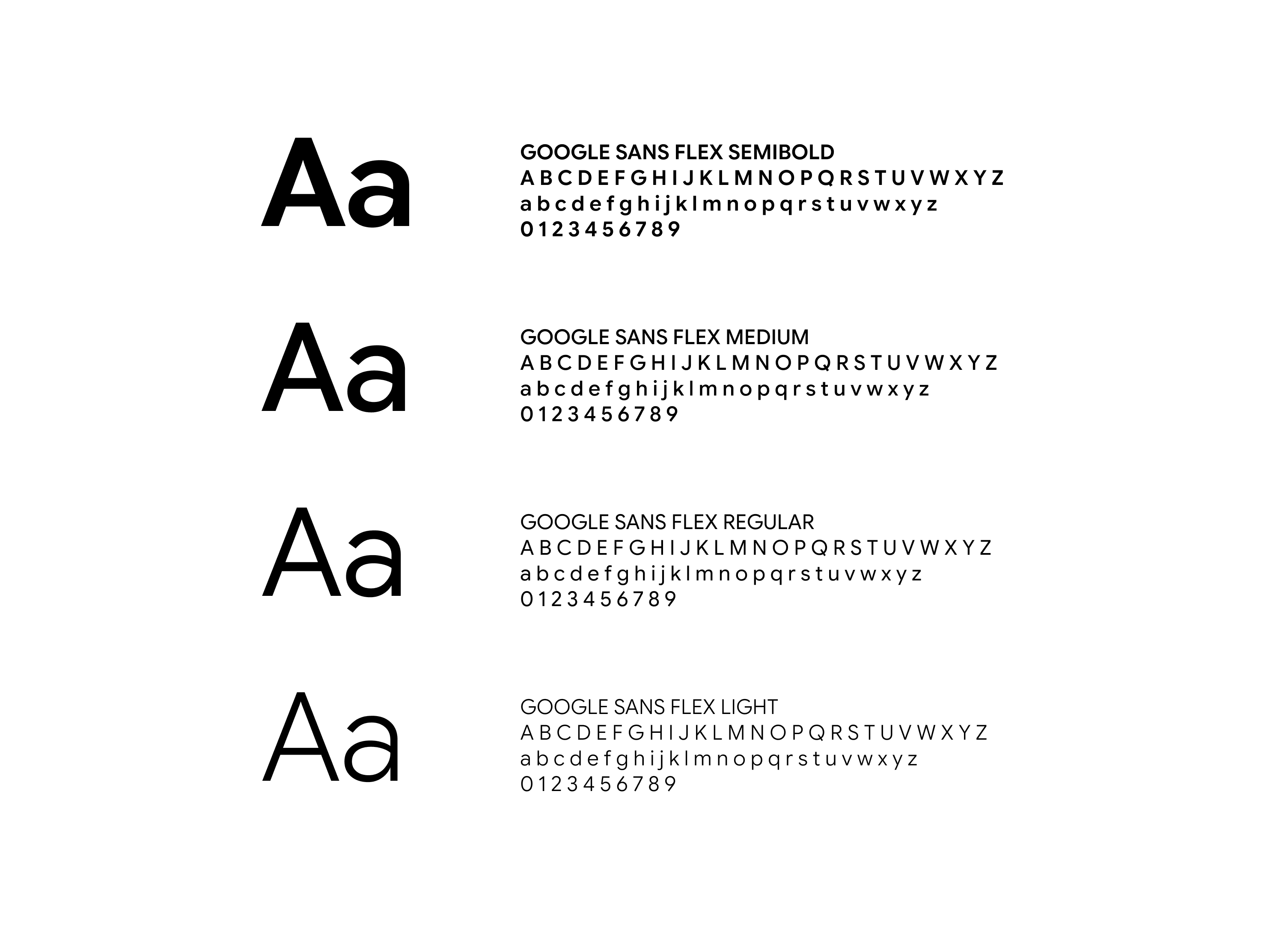
Together, the pairing creates a balanced typographic system:
- Raleway anchors the brand with consistency and recognisability
- Google Sans Flex allows for adaptability, nuance, and scalability
Design Elements: Making the Invisible Visible
Beyond colour and type, the visual language introduces a set of graphic elements that communicate what sprintworks does, not just what it looks like.
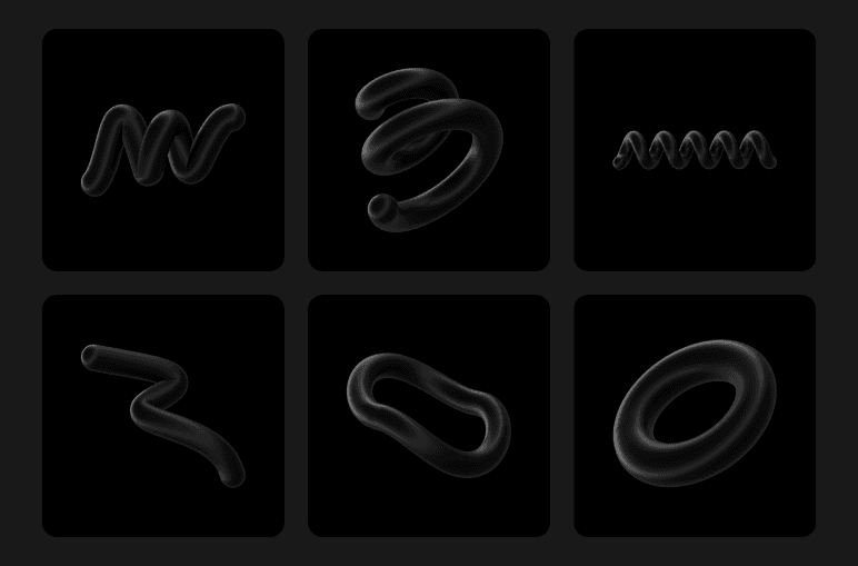
1. 3D Forms – Tangibility & Play
The use of 3D shapes adds a layer of depth and playfulness. These elements represent ideas in motion, concepts being shaped, tested, and refined. They make abstract processes feel tangible, something you can see, not just understand.
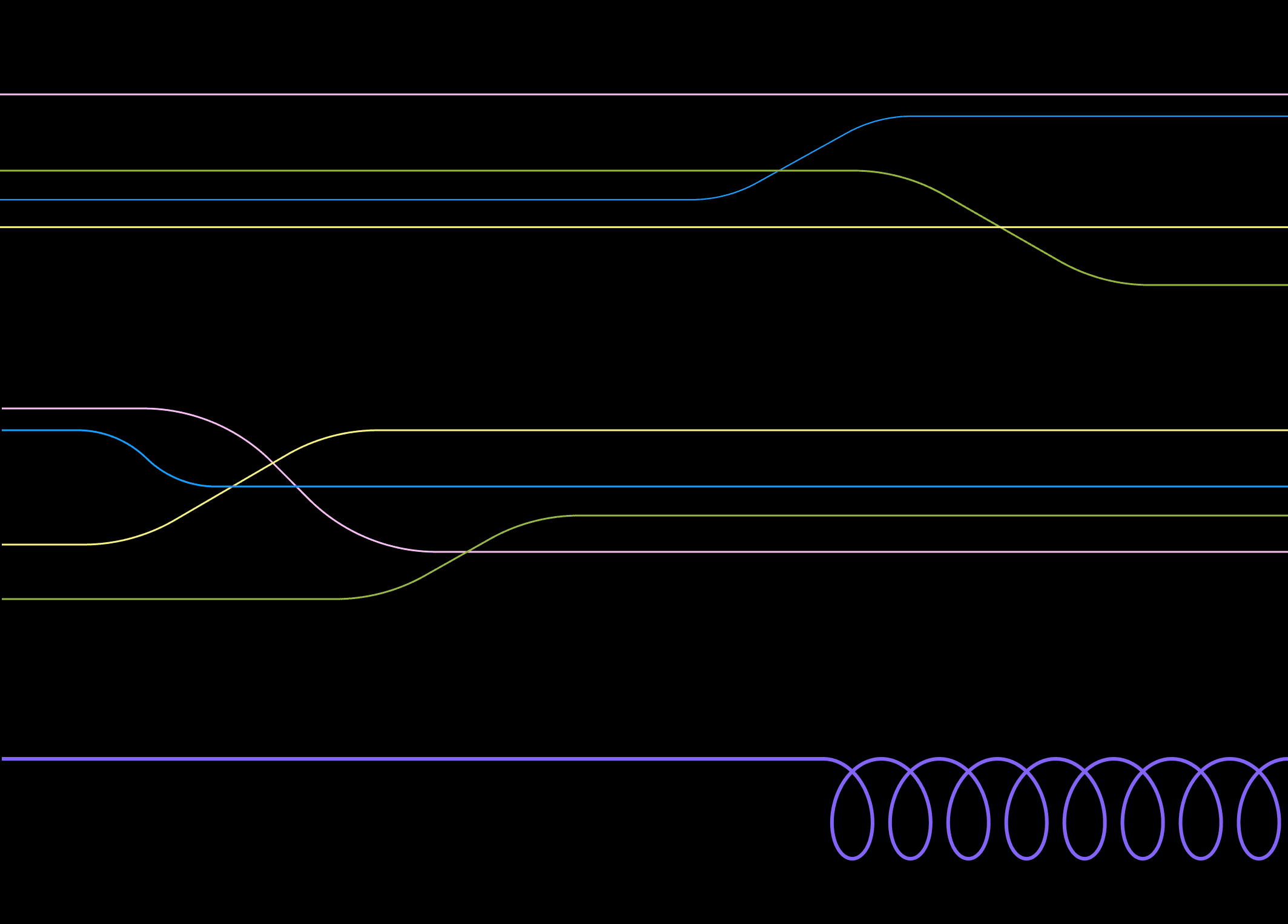
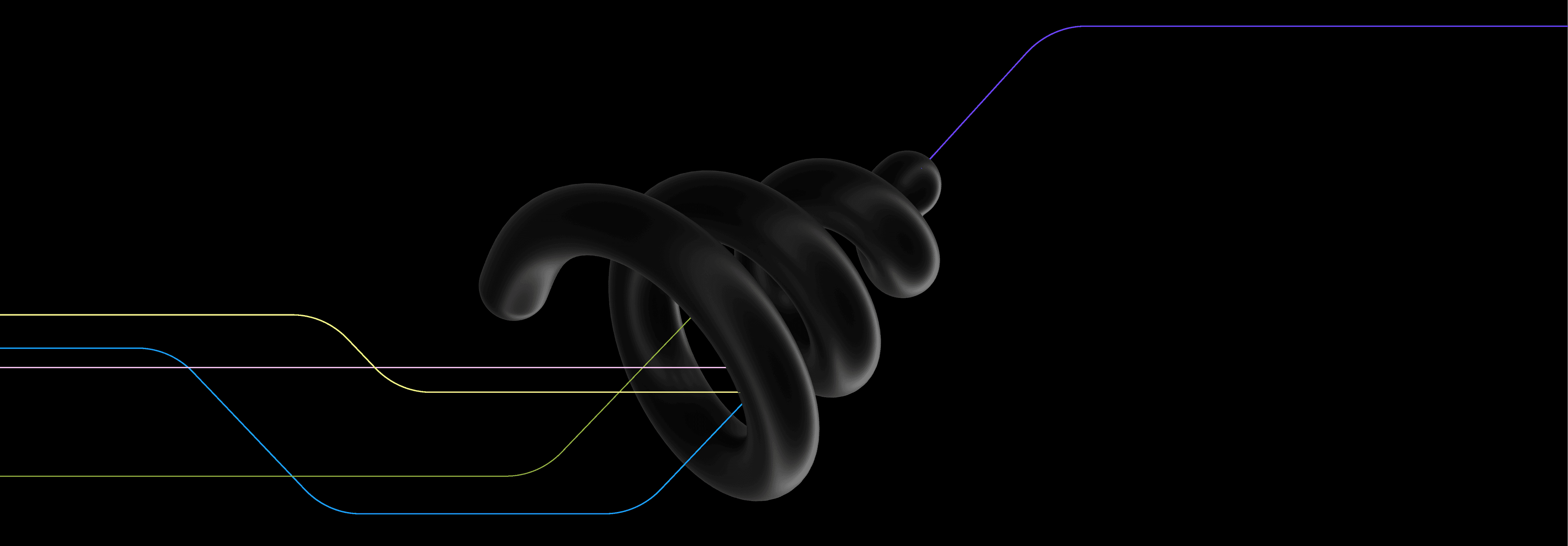
2. Lines – Journeys & Transformation
Lines are a core storytelling device in the system.
- Messy neon lines represent the complexity and fragmentation that most businesses start with. Multiple directions and unclear paths.
- These lines then move through a 3D spiral funnel, a visual metaphor for sprintworks itself. This is where chaos is processed, ideas are refined, and direction is established.
- Emerging from the funnel is a single, clean purple line, representing clarity, focus, and simplified outcomes.
- This transformation captures the essence of the sprintworks process, turning complexity into clarity through structured sprints.
3. Spring Motif – Continuous Momentum
In some applications, spring-like lines reappear as a subtle but consistent motif. These reference the logo while extending its meaning into the wider system.
They represent:
- Iteration
- Continuous delivery
- Momentum that doesn’t stop after a single sprint
This reinforces the idea that sprintworks is not just about speed, but about sustained progress over time.
Bringing It All Together
The visual system for sprintworks is not decorative; it is descriptive.
Every element, from colour to typography to motion-inspired graphics, is rooted in the same core idea of taking something complex, accelerating it through structured thinking, and delivering it with clarity.
And most importantly, it reflects not just what sprintworks looks like, but how it works.